ZHAOSHANG XIAN XI
Hidden in the form, flourishing in the heart's perceptionThe profundity of Chang'an quietly blossoms in a petal of camellia.
| Hidden in the form, flourishing in the heart's perception - Let the profoundness of Chang'an quietly bloom in a camellia petal. | |||||
 | |||||
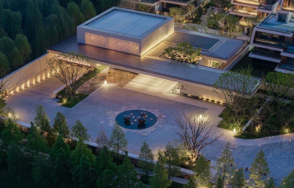
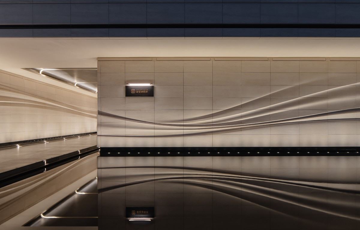
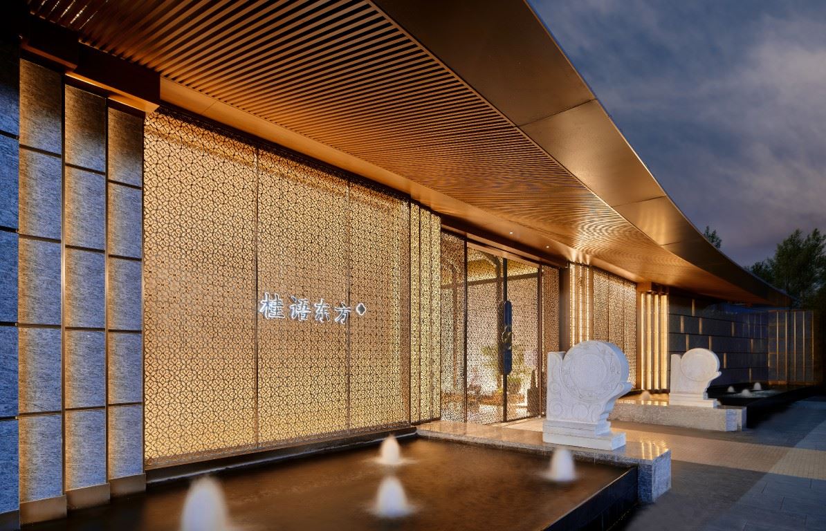
 | The design of China Merchants Xi'an Xi abandons the superficial prosperity and quietly responds to Xi'an's profound and introverted culture in a clean and restrained way. The logo selects three materials: copper, mother-of-pearl, and stone, and the texture levels quietly emerge in the details: the thickness of copper is like the accumulation of time, the soft light of mother-of-pearl brings warmth, and the coolness of white stone adds tranquility and transparency to the space. This kind of quietness is unassuming, but the more you look at it, the more flavorful it becomes. It doesn't show off, yet it exudes its own power. | ||||
Be like a camellia, quiet yet powerful. Our design inspiration comes from the camellia, but instead of directly depicting its form, we start from its structure and reconstruct its rhythm. Through the formal languages of symmetry, layering, and openness, we distill the inner sense of order and vitality. Camellias do not compete for beauty in spring and summer but quietly bloom in the cold winter, being quiet, firm, low - key yet full of power. The temperament conveyed by this symbol is: not following the crowd, having one's own style; being restrained and pure, and always full of tension. |  | ||||
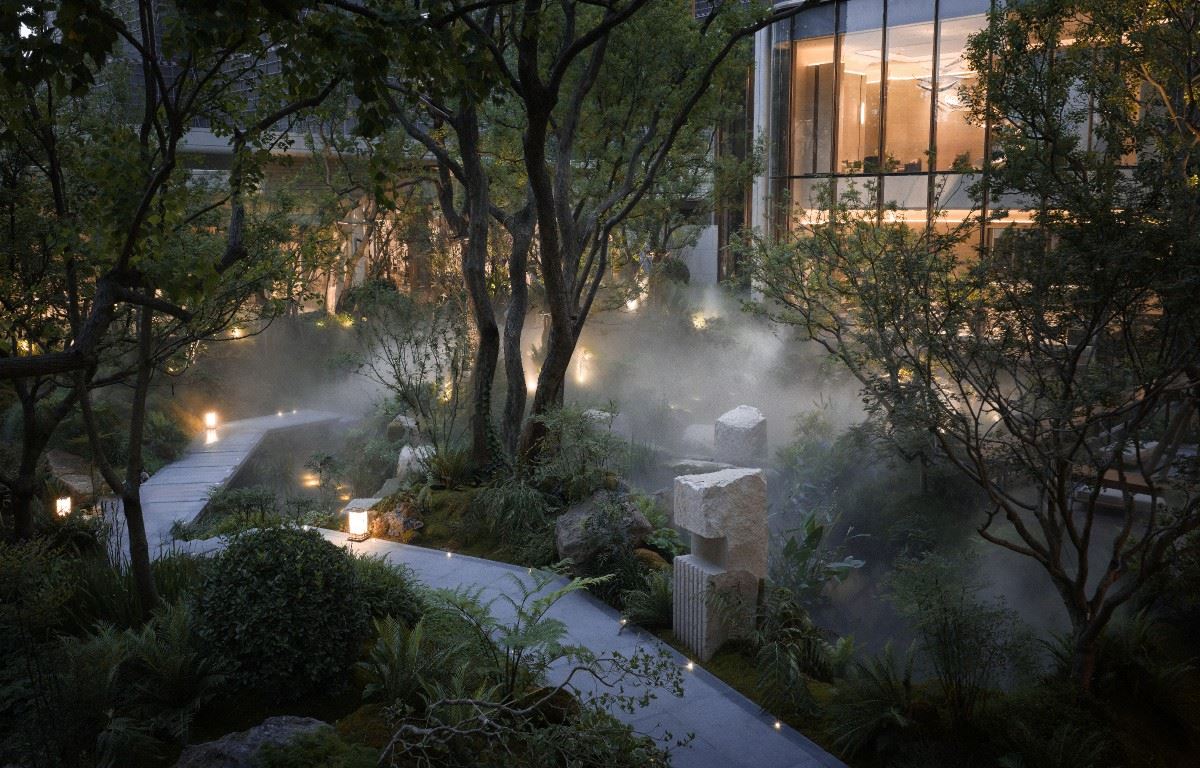
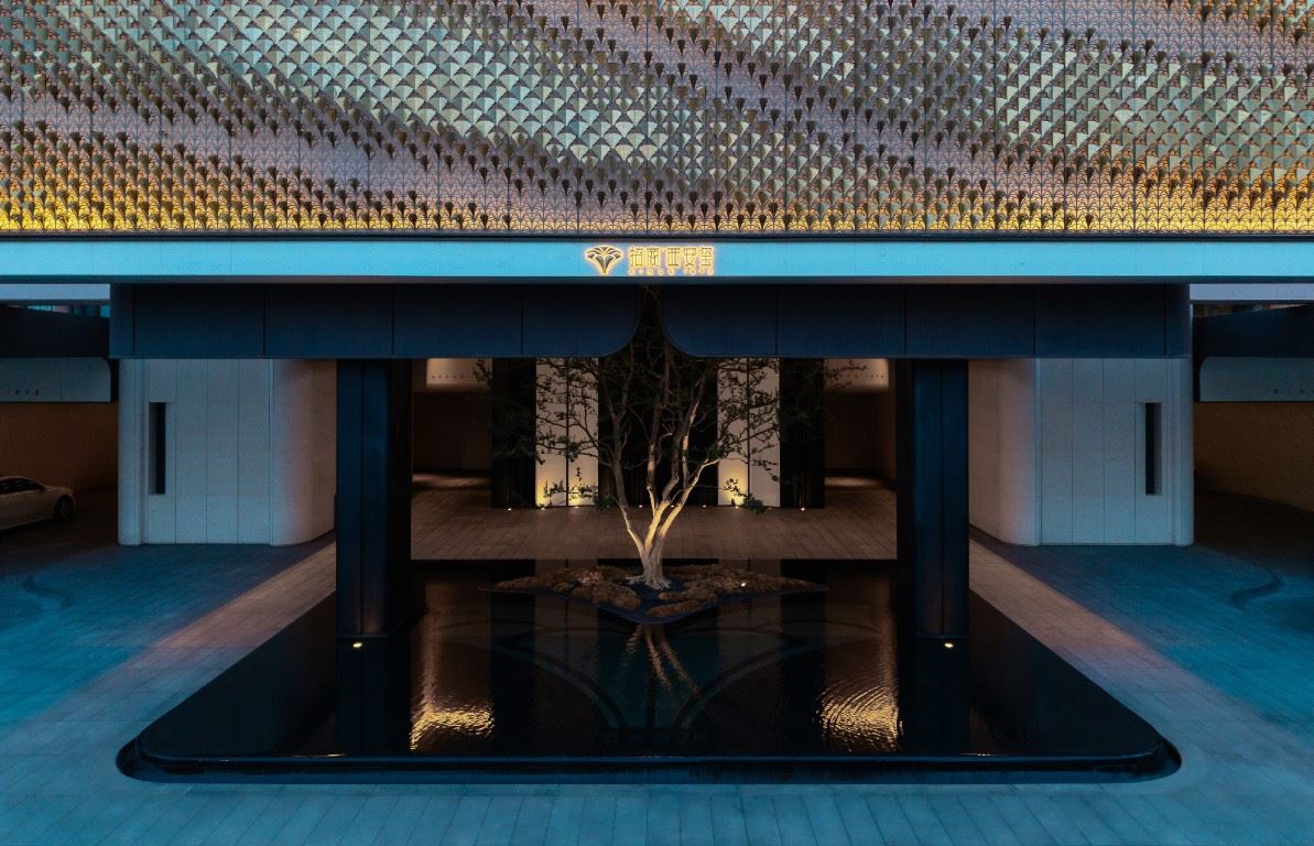
 | Like camellias blooming quietly, without noise, forming both a scene and an artistic conception. As part of the overall landscape construction, it echoes with other elements in the environment. We have broken the traditional single-functional design of "signs are wayfinding", and instead adopted a landscape design, allowing the signs to blend naturally into the site and become a "scene" and an "artistic conception" in the space. | ||||
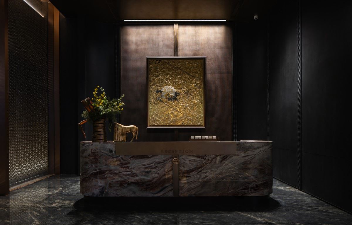
One bloom, one evolution; the camellia witnesses the elegant growth of the Merchants' Seal series. The Merchants' Seal series continues to optimize through continuous refinement, paying attention to every detail. The Xi'an project is upgraded based on the Hefei product. While continuing the design language, it integrates more local culture. We select rare white mother-of-pearl material to reshape the camellia logo. Its warm, translucent, and iridescent luster not only echoes the noble temperament of the ancient capital of Xi'an but also fits the current low-key, luxurious,and elegant aesthetic. This new logo is not just a visual update but also a new expression of the Seal series in the urban context. |  | ||||
 | The camellia gently touches the space, with layers and charm fully expressing the sentiment. The design uses the camellia as an ornament in the space, appropriately adding a touch of delicacy and charm. It is not the protagonist, but it makes the entire space more layered. The material of white mother-of-pearl and the shape of the camellia have a strong "bite feeling". | ||||
It blooms so gently, as if afraid of disturbing the suspended dust in the air. Camellias adorn every space. Even the sign of the bathroom, like a silent director, precisely arranges every detail, endowing the space with its unique warmth and style. It not only provides clear guidance but also tells the story of the space with concise and powerful graphic language, making the functional symbols full of charm and beauty. The boundaries of camellias gradually blur, and buildings and landscapes quietly blend into one. The image of the camellia, like a melody, runs through the facade, landscape, and signage. It is not a decoration but a part of the structure, resonating with light, materials, and proportions to form a humble yet elegant language. Good design is a narrative of existence; a good designer is a ferryman of emotions. In the signage creation of China Merchants Sheer Series in Xi'an, we were once puzzled by the renewal of super symbols and the capture of the city's temperament. Eventually, white mother-of-pearl and camellias completed a cross-month dialogue - the material is as warm as the morning and evening of the ancient city wall, and its iridescent flow is like the poetry in Chang'an. 项目位置:陕西-西安 项目名称:招商西安玺 项目业主:招商蛇口西安公司 标识设计:上海柏熙标识有限公司 设计团队:张燕琴、任诚、刘鉴、陈杨洋、朱明杰、王辰橹 建筑设计:日清景观 景观设计:汇张思 室内设计:纳沃 / 矩阵纵横 / 明德 摄影视频:朱胡兵 |  | ||||