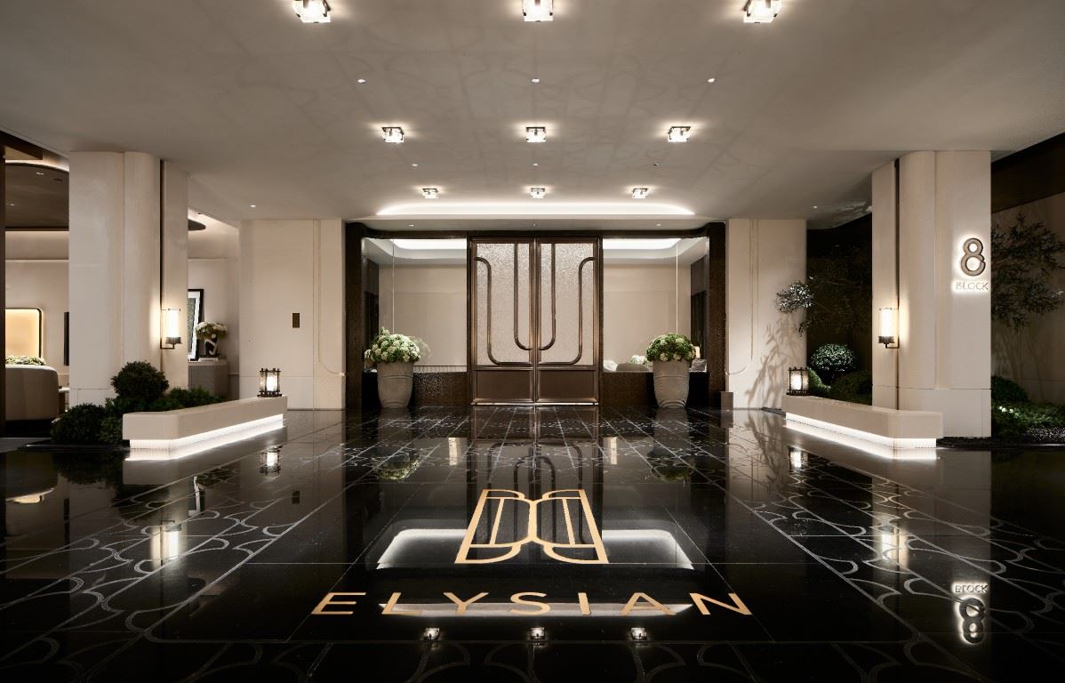
ELYSIAN
Heaven bestows, and chess touches the heart.This is not only a continuation of visual elements, but also a complete expression of spatial narrative.
 | |||||
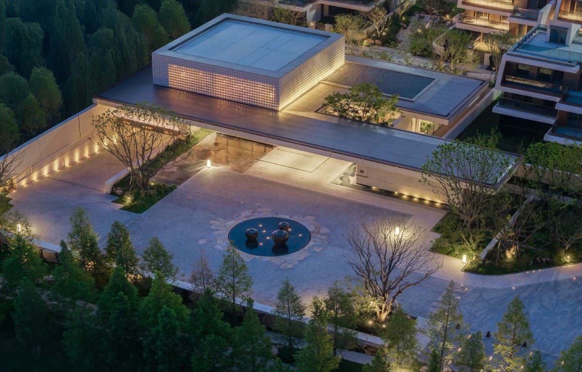
The Realm of Luxury Mansions, Where Relaxation is the Epitome of Luxury ——Poly's First CBD Luxury Mansion with a Relaxing Resort-like Ambiance |  | ||||
 | "Tianyi" is a new luxury resort - style brand of Poly named with "Yi" under its Tian series. It inherits the consistent high - end pattern and quality pursuit of the Tian series. At the same time, it injects the laid - back genes of vacation into the heart of the city, making luxury not only about form, but a return of the state of mind. Unlike the common elaborate and cluttered style, Tianyi wins with restraint - using a single and pure material, highlighting the shape and sense of space, and creating a comfortable and leisurely atmosphere. Such "austere luxury with Leave blank space" gives life and returning home a more refined spiritual style. | ||||
01 / Taking the door as an image, distilling the Tianyi spirit The LOGO we designed for Tianyi is inspired by the arc of the building's exterior. The image of the "door" is condensed into symbolic language. It not only echoes the welcoming gesture of the landscape but also reflects the upright tension of the building. In the unity of form and meaning, it is no longer just an identification symbol but a spiritual manifestation after the convergence of architecture, landscape, and the concept of living. |  | ||||
 | 02 /In the order of symbols, lay out the ritual realm of returning home In the implementation of the project, the lines of the architectural landscape extend a sense of dignity upon returning home. The LOGO of the Tianyi system, as the core symbol, is naturally integrated into the architecture, landscape, and interior design - it not only represents the ritual of returning home but also makes the different spaces more unified and stylish. The existence of this symbol clearly magnifies the project's genes in every presentation. | ||||
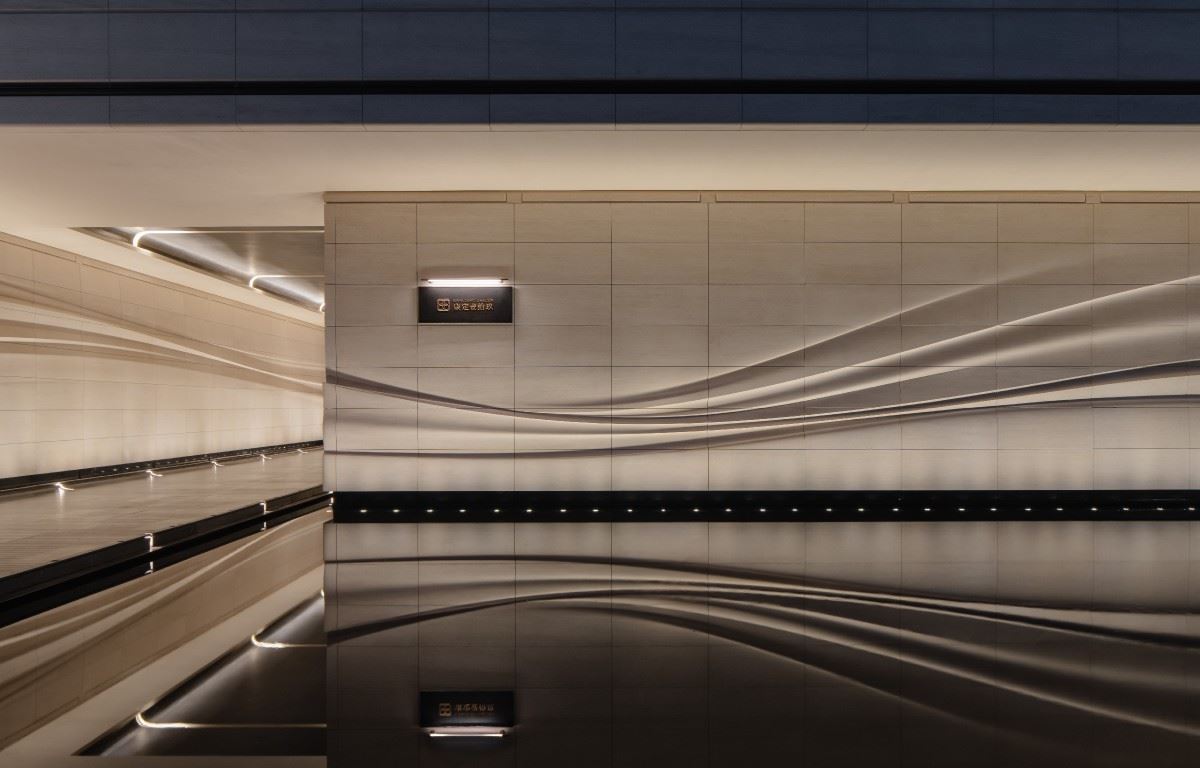
03 /In the order of arcs, connect details and the whole We take the arc as the design theme and extend it to small components such as logos, signboards, and trash cans. Every detail echoes the arcs of the architecture and landscape, forming a unified visual logic. In this way, they not only serve their functions but also inject aesthetics into the details. The small items in daily life also reflect the unique temperament of Tianyi. |  | ||||
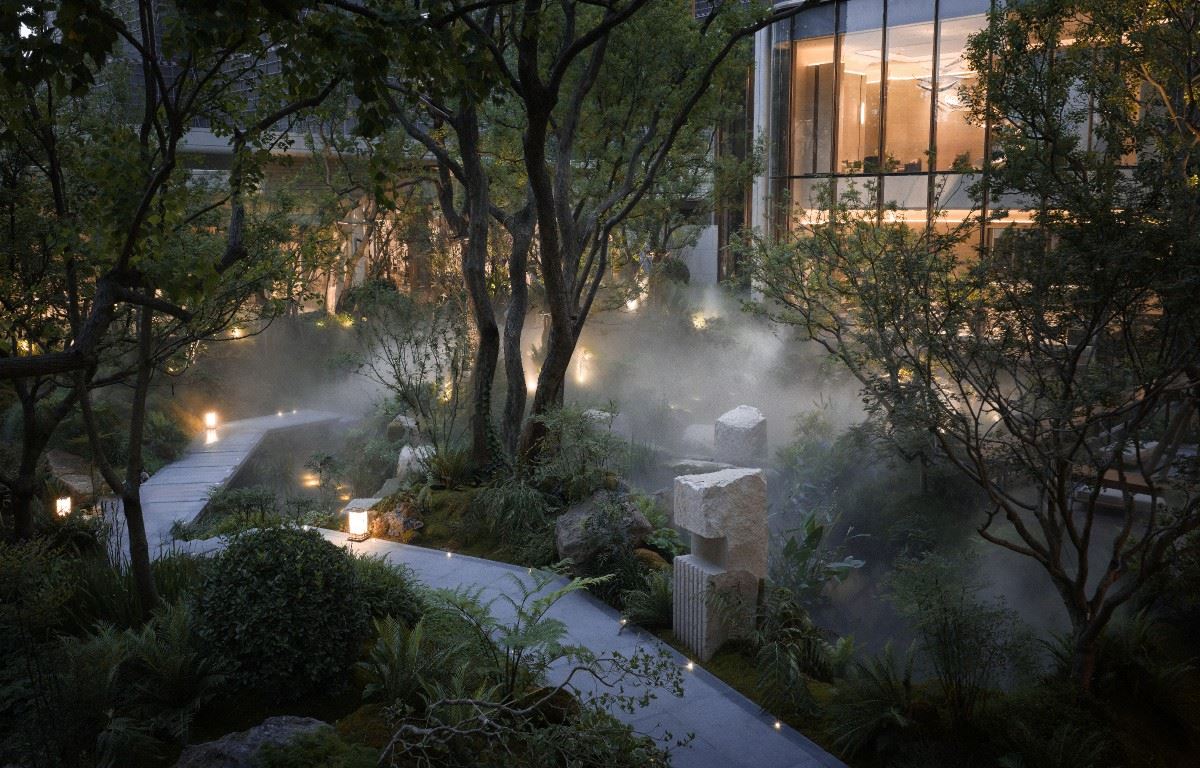
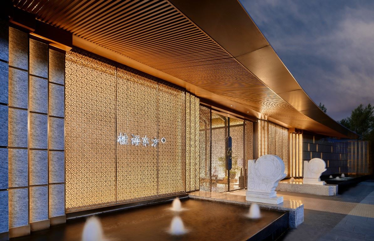
 | 04 /Bounded by the scenery, polishing stones into a realm, seeing the beauty of relaxation In the landscape interface, we hope to create a sense of relaxation and being enveloped, making the space appear more expansive within the geometric order. The signage design should blend in naturally, not as a separate component, but rather echo the landscape. We use warm jade as the main material, making the signage look restrained, understated, yet full of texture. | ||||
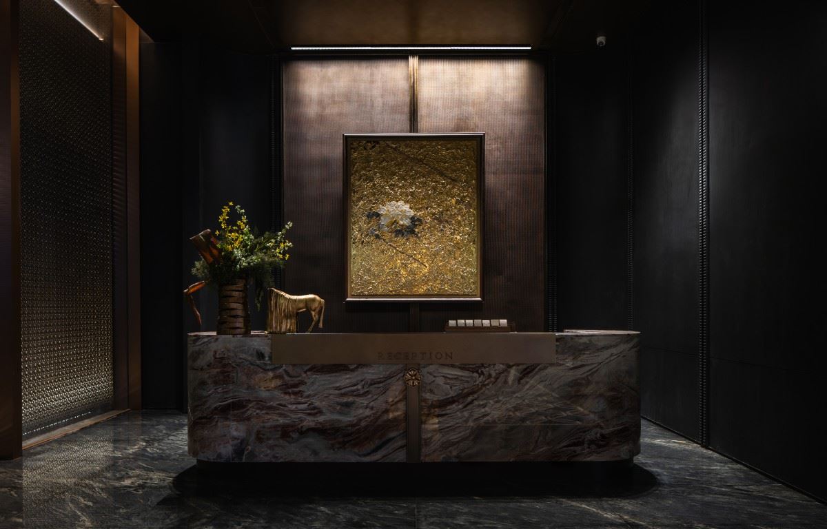
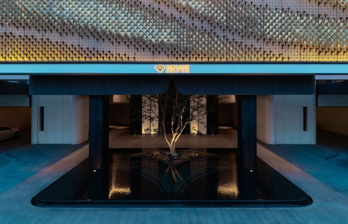
05 /With simplicity as the measure, hidden luxury reveals itself. In the interior signage design, we incorporate symbolic language and integrate it into every detail of each icon to make the whole more unified. The proportion and details of the signage are kept restrained, not overshadowing the main elements, yet still demonstrating quality in materials and craftsmanship. It blends naturally with the environment, conveying the elegance and order of Tianyi in a low - key manner. This design essentially involves translating a two - dimensional graphic language into an entire spatial context. We faced the challenge of integrating the LOGO with architecture, landscape, and interior design. Using doors and arcs as the core elements, we re - organized them into extendable symbols. Finally, these symbols were incorporated into facades, pavements, and interior finishes, giving the entire project a unified feel from the outside in. Every detail reflects our commitment to design consistency. This is not just a signage system, but a complete spatial expression. 项目位置:广东-广州 项目名称:广州保利天奕 项目业主:广东保利城市发展有限公司 标识设计:上海柏熙标识有限公司 设计团队:张燕琴,陈杨洋,刘鉴,任城,朱明杰,王秋燕 建筑设计:上海霍普建筑 / 广州瀚华建筑 / LWK 景观设计:加特林(重庆)/广州怡境规划 室内设计:深圳郑中设计 /广州原矢装饰 摄影视频:DO STUDIO |  | ||||