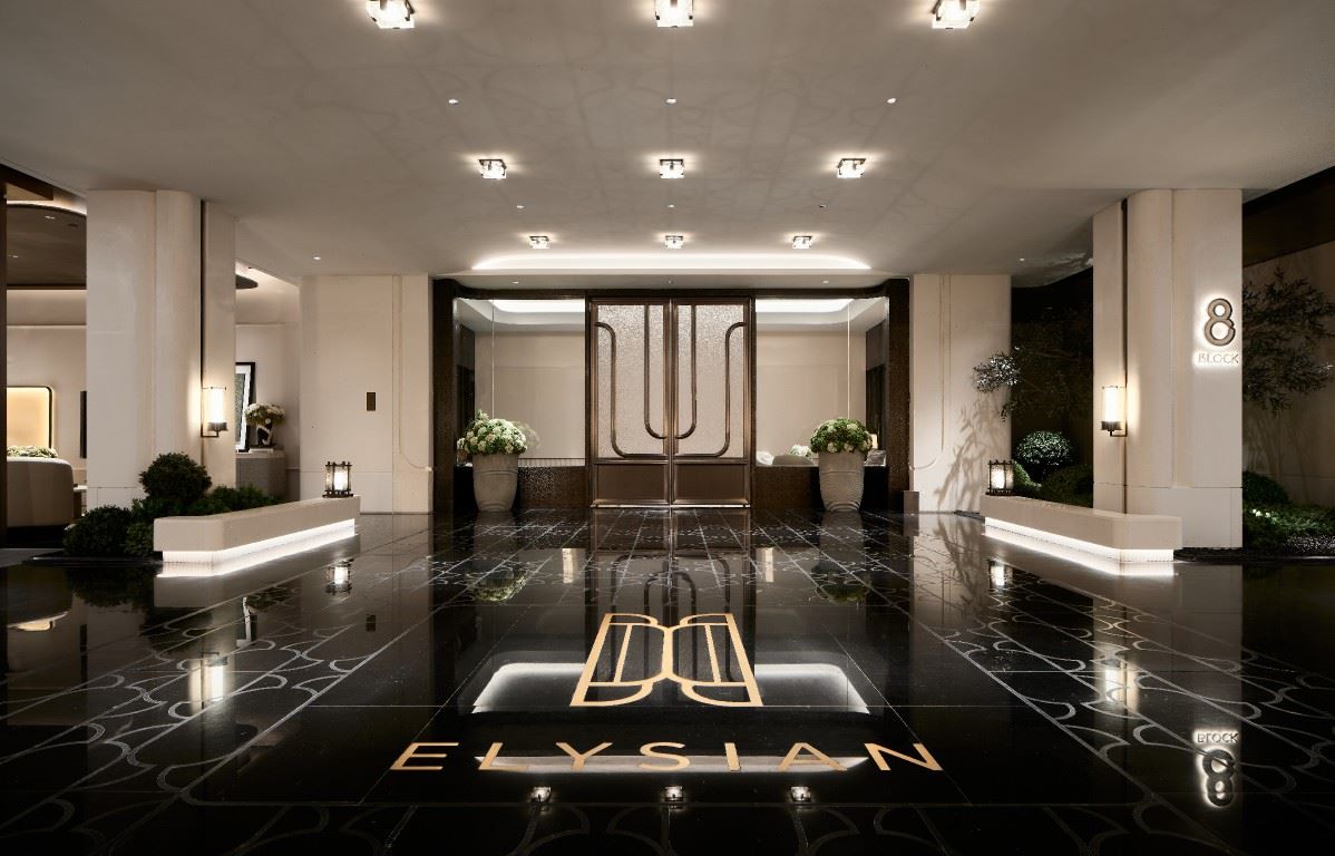
HE YUAN
One vine and one tendril weave the years, one stone and one tree return to nature.Overlay contemporary space and life on nature, and overlay the profundity and humility of life.
 | |||||
“Nature is the source of art, from which all things draw strength.” |  | ||||
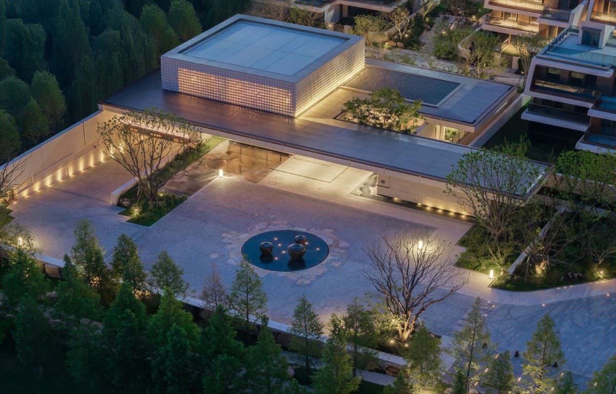
 | Nantong is a city with the "boldness of the rivers and seas", just like the majestic momentum accumulated before the Yangtze River rushes into the sea. But when you come to the Zilang Lake, this boldness turns into a peaceful elegance. China Merchants Shekou · Heyuan is closely adjacent to the shoreline of Zilang Lake and directly reaches the湖心 island. It fully integrates and seamlessly blends natural resources with living spaces. Here, the city is accompanied by the lake, and trees and houses coexist. This philosophy of seclusion in the embrace of nature highly coincides with the spiritual core of Aman, and it is also the true essence of hidden luxury in the contemporary context. | ||||
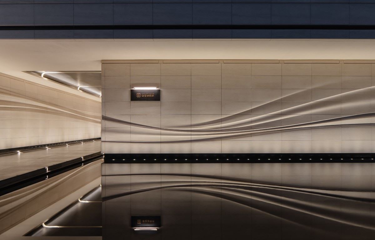
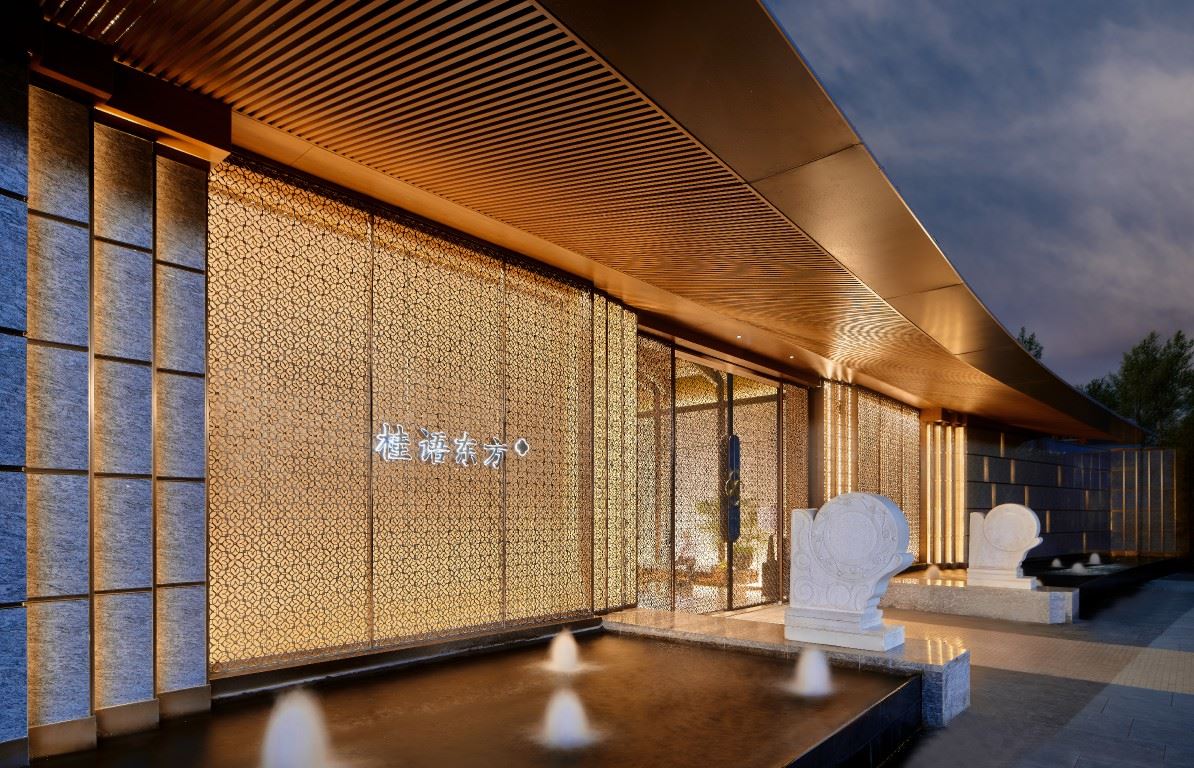
01 Heyuan: The Natural Echo in the Aesthetics of Seclusion Heyuan draws inspiration from Aman Hotel's隐逸 philosophy of "revering nature". With naturalistic landscape language and techniques for creating hidden luxury spaces, it makes the architecture take root in the land, integrates humanity into nature, and makes the signs echo the environment. Every detail reveals ingenious ideas that resonate deeply. For example, the image wall at the entrance of the community is thick yet exquisite. The logo on it adopts the casting bronze carving process, and the fine woven texture is palpable. The wall is made of desert - style stone, paired with the classic color - matching of Nantong intangible cultural heritage hand - woven homespun cloth. In this way, the millennium - old cultural context is translated into an aesthetic language understandable to modern people, rejuvenating in the passage of time. |  | ||||
 | 02Wisteria: A Cultural Symbol Hidden in the Community Inspired by the century-old wisteria at Hao'nan Bieye, the former residence of Zhang Jian. It is vigorous, with winding vines and cascading green leaves, symbolizing the endless inheritance of the family. We incorporate this vitality into the community logo design. Taking the Nantong intangible cultural heritage rattan weaving technique as the spiritual core, the warmth of fingers flying and bamboo strips interweaving endows the logo with a human touch. Then, it is shaped by metal engraving, making the wisteria totem retain the softness of handicrafts while adding a modern sense of uprightness. It is not just a decoration. When the craftsmanship of traditional handicrafts blends with the simplicity of contemporary aesthetics, the cultural flavor of Nantong naturally permeates every corner. | ||||
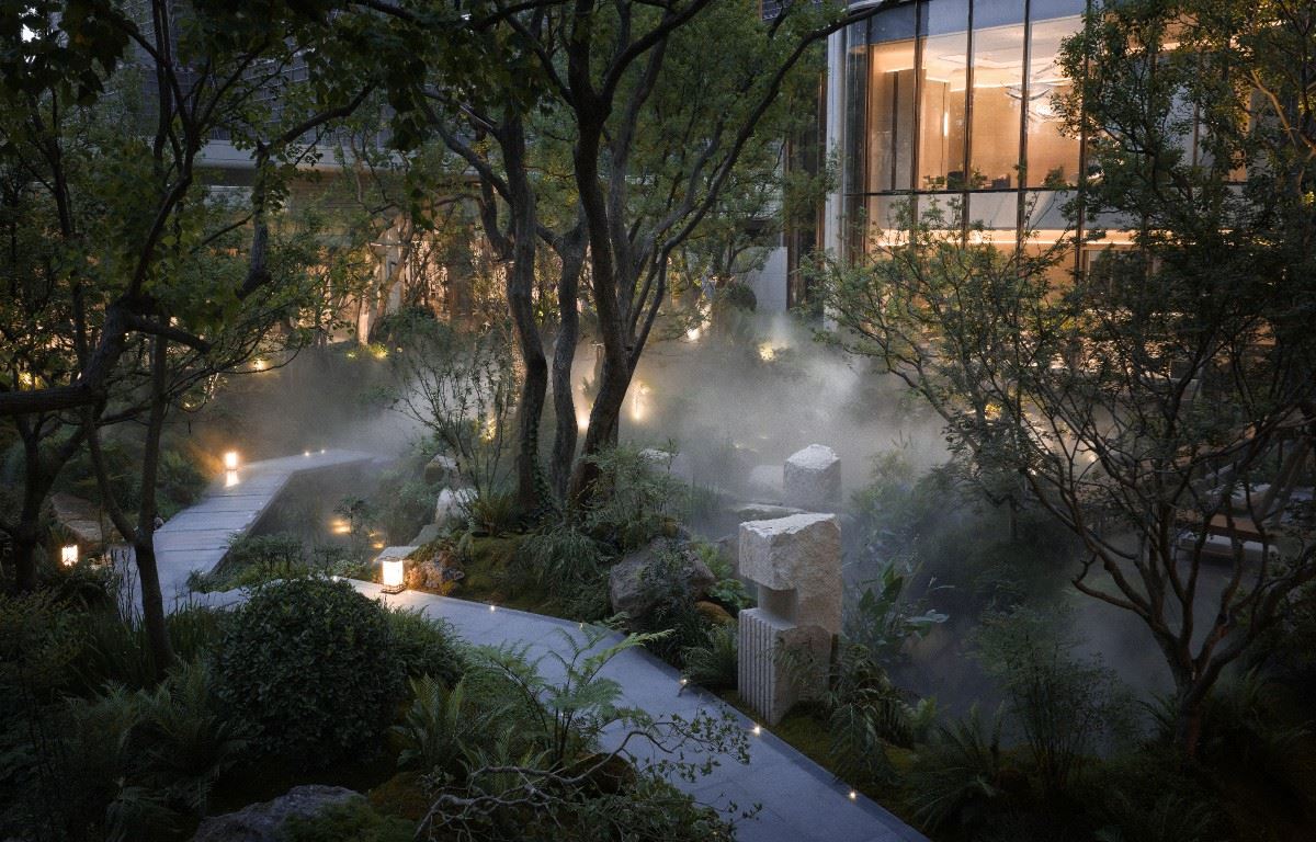
03Entering the Painting: The Gentle Footnote Hidden in the Garden Wisteria is the spiritual totem of Heyuan Garden, growing quietly in the garden - it doesn't seek attention, yet it always meets you around the corner. Sometimes it climbs on the pergola, sometimes it hides among the hedges, telling the gentle fables of the same nature in different postures. The signs here are never ostentatious, only serving as the right kind of embellishment, like the final touch when painting a dragon. Strolling in the garden, every stone and tree is a messenger of nature, softly telling the stories of thousands of years of time. The soft materials and warm colors make the hasty heart unconsciously settle down and return to the most authentic state of relaxation. |  | ||||
 | The form of wisteria extends to inspire the logo - the naturally stretching lines of the vines become the rhythmic nodes connecting the space. The signboard selects the steadiness of dark bronze, the warmth of natural wood color, and the elegance of yellow bronze. It seems to grow naturally from this land, blending seamlessly with everything around it, unobtrusive yet perfectly fitting everywhere. | ||||
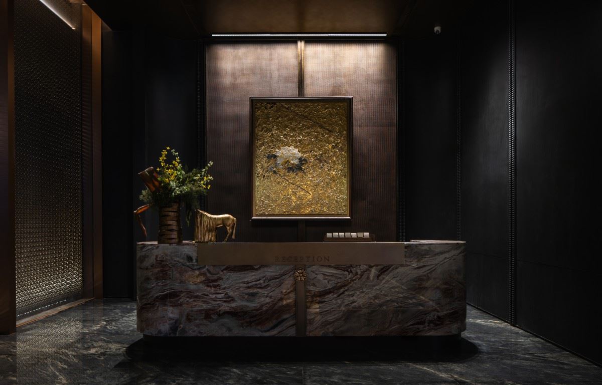
04Returning Home: The Honorable Ritual Sequence of the Underground Garage The design of the underground garage draws inspiration from the sense of ceremony of the Central Station, making every return home feel like arriving at a meticulously prepared welcome ceremony. The signage here adopts a plaque - style design, with a dignified font and a simple border, silently conveying respect for the property owners and making the space appear more serene and high - end. At the entrance of the driveway, the dynamic spotlight lighting gradually lights up as the vehicle moves forward, guiding the way and adding a sense of technology. The background wall made of travertine is thick and steady. Paired with the LOGO crafted with rattan - weaving technique, the warm texture of traditional handicrafts collides with the natural texture of natural stone, instantly enhancing the style of the space. The aluminum plate ceiling integrated with wisteria flower elements immerses every step of the way home in a sense of ceremony. From the entrance to the parking space, it is not just an arrival but also a journey treated with care. Nature is the simplicity stacked by time and the growth accumulated by time. Upon nature, contemporary space and life are superimposed, along with the profundity and humility of life. Let the beauty of nature return to the essence of life. 项目位置:江苏-南通 项目名称:招商蛇口·南通和园 项目业主:招商蛇口苏南公司 标识设计:上海柏熙标识有限公司 设计团队:刘广梅 陈苗苗 王倩倩 王辰橹 建筑设计:上海正象建筑设计有限公司 景观设计:上海日清景观设计有限公司 室内设计:明德设计 / 31设计 / 里约设计 / 集艾设计 / 纳沃设计 摄影视频:朱胡兵 |  | ||||