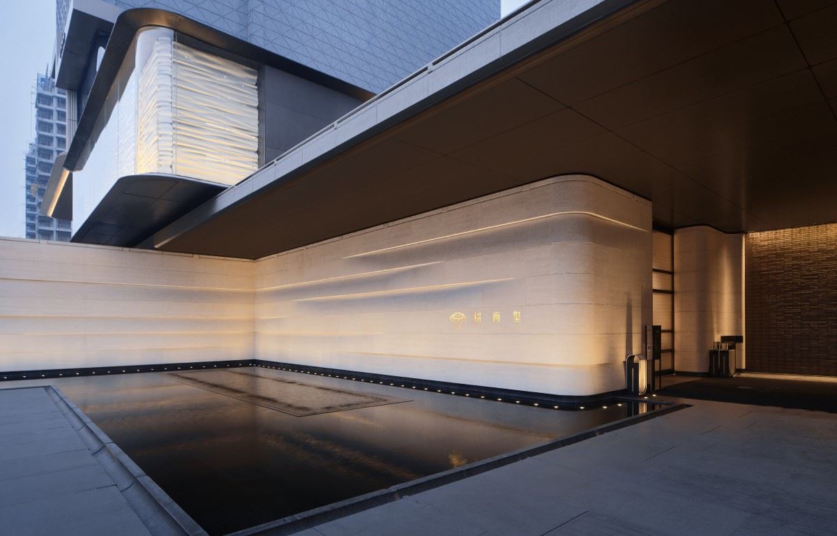
Serenity Mansion
In autumn, the jade warms as it melts; In the deep shade, the heart finds peace.The wishes of "Peace and Harmony for All" turn into the morning and evening lights and shadows, blending into a peaceful and happy gaze in the autumn scenery.
 | |||||
Amidst the uneven golden and green pavilions, one offers thanks; In the unfurling mist and clouds, it's like a painted scene. ——A couplet in the Summer Palace |  | ||||
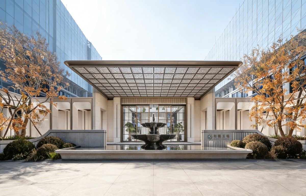
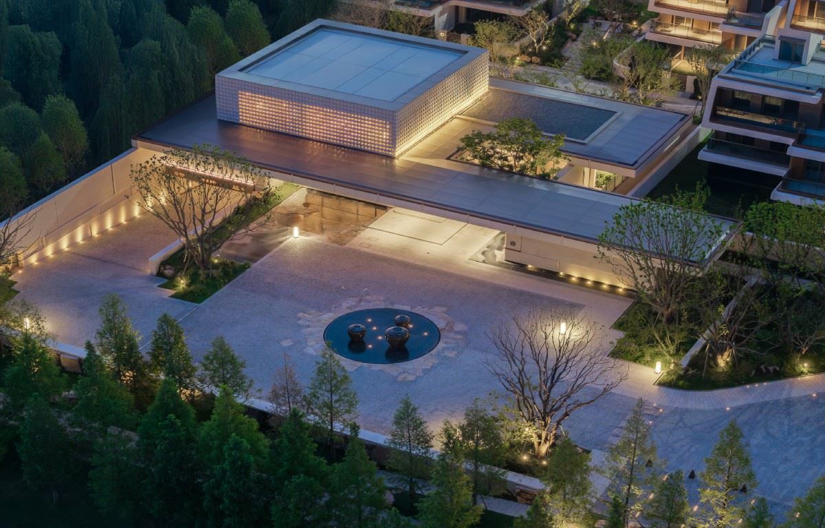
 | In the intoxicating autumn scenery of Beijing, the grand entrance of Heyue Yuming gracefully opens: Above the central axis, the French romantic sentiment and the Oriental royal charm are no longer just style labels. Instead, they are integrated into the daily morning and evening lights and shadows, becoming the warm background color of home. This is not only a eulogy for the prosperous and peaceful era but also a deep - seated expectation for the serene years and harmonious family, allowing every ordinary day to be soaked in stability and happiness. | ||||
01 The small logo contains the whole world, and the integration of Chinese and Western charm shows peace and harmony. As the first joint project of Greentown and Yuexiu in Haidian, the logo of Heyue Yuming is inspired by the "Wanfang Anhe" in the Old Summer Palace, taking the shape of the "swastika" - shaped building and condensing it into the exclusive totem of the project. This pattern is forged with the traditional cloisonné - enamel technique. Under the sunlight, the glaze color shows a lake - like blue. When the autumn wind blows, a few fallen leaves dot the water scenery. In the beautiful autumn light, the blue and gold interweave and shine together. The pattern is inlaid with natural stone in layers, echoing the stepped rhythm of the building facade in the style of Carlo Scarpa, making the craftsmanship and the architectural context blend and complement each other. |  | ||||
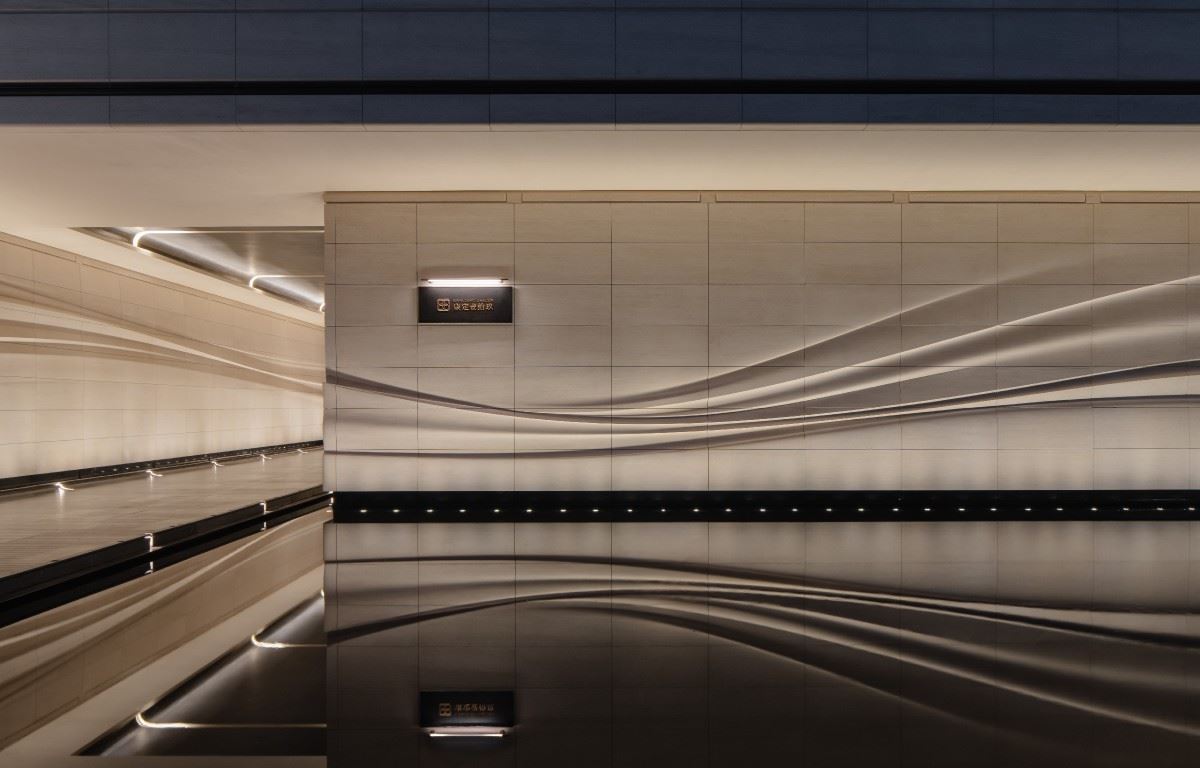
 | Discover order in the layers and craftsmanship in the details. The design of the signage system aims to create visual order and naturally integrate into the poetic environment of French romance. Through exquisitely crafted fonts, precise scale control, and a design language of layering and progression, we ensure that the signage continues the logic and rhythm of the building facade. In the courtyard, the signage is carefully embedded in the walls combined or with the landscape to minimize interference with the tranquility of the space. In this limited space, it not only reflects the beauty of order in the architecture but also conveys the poetry of the garden and the sense of peace in the living environment, showing refinement in the details. All these efforts are made to turn the signage from a rigid mark into a gentle and elegant visual guide, ultimately creating a complete, harmonious, and reassuring living scene. | ||||
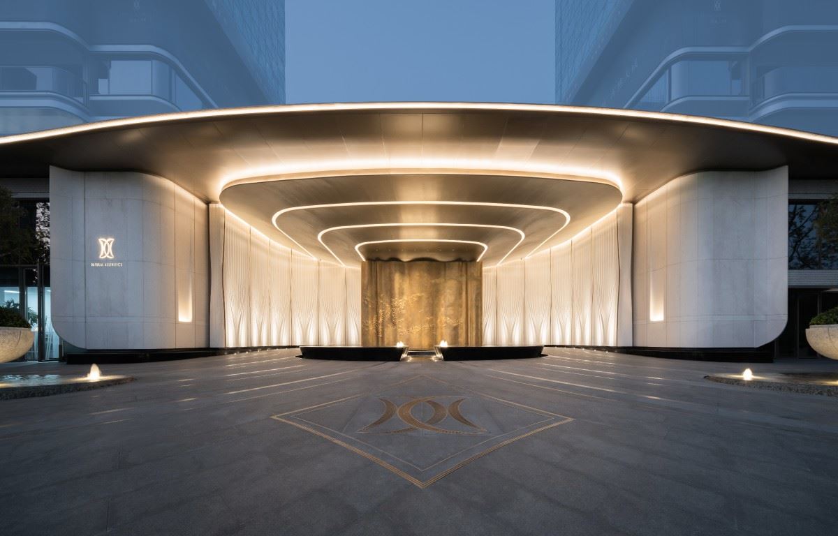
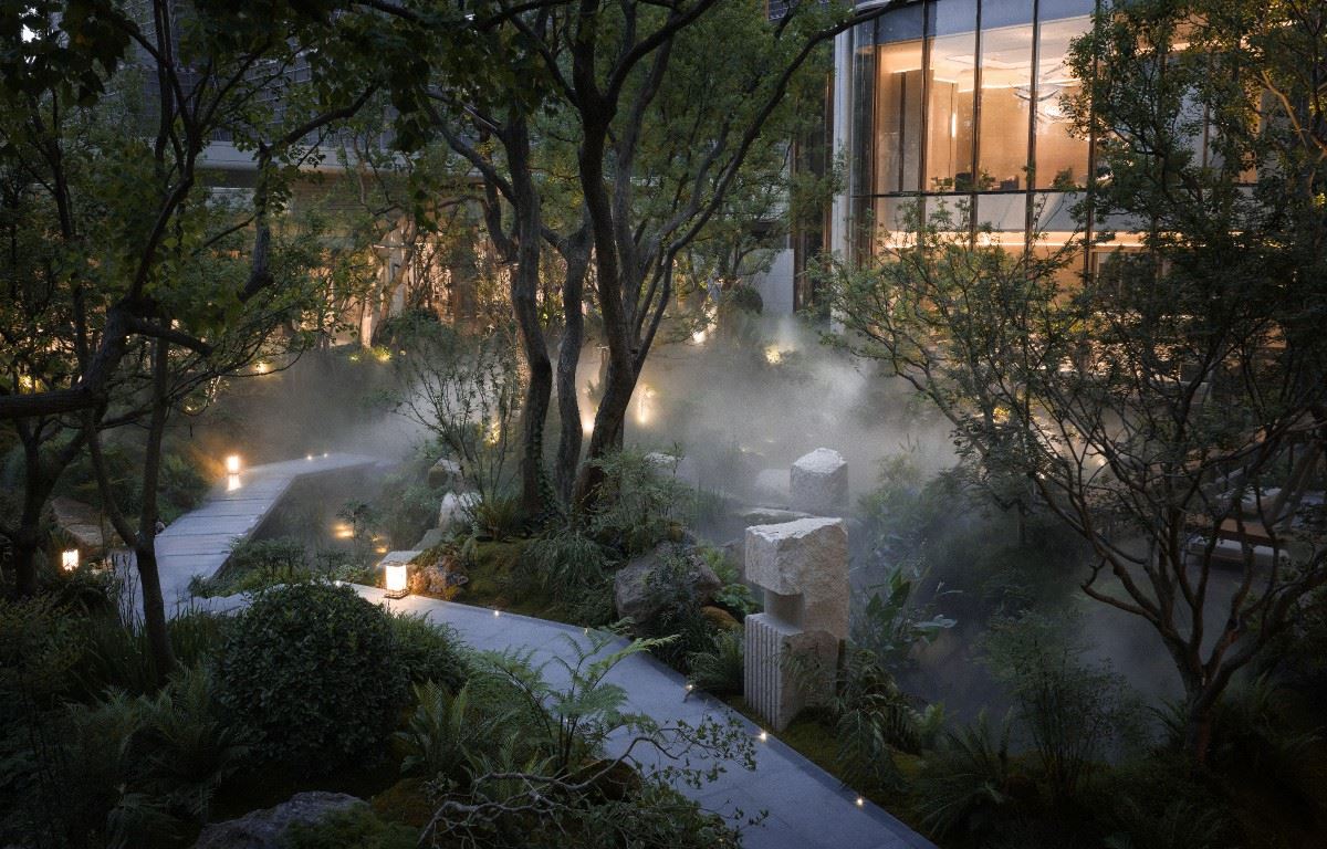
03 Embodied in the vessel, the design achieves a state of peace and harmony for scholars, symbolizing the universal peace. Time is like a passing traveler through the ages. The area around Gongde Temple has witnessed the passage of time and accumulated profound historical heritage. It is adjacent to the Three Hills and Five Gardens and is home to many universities, exuding a long - lasting cultural atmosphere. The logo is designed using white ice jade, which is known for its gentle texture and clear color. Combined with fine - crafted metal, it has a simple shape and an elegant and serene temperament. This design does not pursue complexity but focuses on creating a sense of reserved and implicit belonging through the natural combination of materials and craftsmanship. In the past, "Wanfang Anhe" in the Old Summer Palace expressed the wish for national peace; today, Heyue Yuming builds residences here, hoping to create a home where scholars in Haidian can find peace of mind and body. What the design ultimately pursues is this tangible and perceptible sense of calm and peace. |  | ||||
 | 04 Commence a peaceful journey with a serene overture The signage design of the underground garage starts with functionality, taking into account the visual integrity and sense of order. The overall space uses neutral and gentle colors. The designer applies the fine - detailed patterns to the column surfaces to echo the floor parquet, thus establishing a unified environmental language. The auxiliary graphics are modularly designed and distributed on the guide walls and corner nodes at an appropriate scale and rhythm, forming a clear and coherent visual guidance. The design aims to create a clean, bright and easily recognizable spatial experience, achieving a balance between practicality and aesthetics, making every journey home calm and clear. 项目位置:北京-海淀 项目名称:北京绿城·和樾玉鳴 项目业主:北京功意房地产开发有限公司 标识设计:上海柏熙标识有限公司 设计团队:代健美、章春萍、熊宝库、王辰橹 建筑设计:上海越界建筑设计 / 李徫珉 景观设计:GTS蓝颂 室内设计:HWCD 摄影视频:朱胡兵 | ||||