MARINA ONE
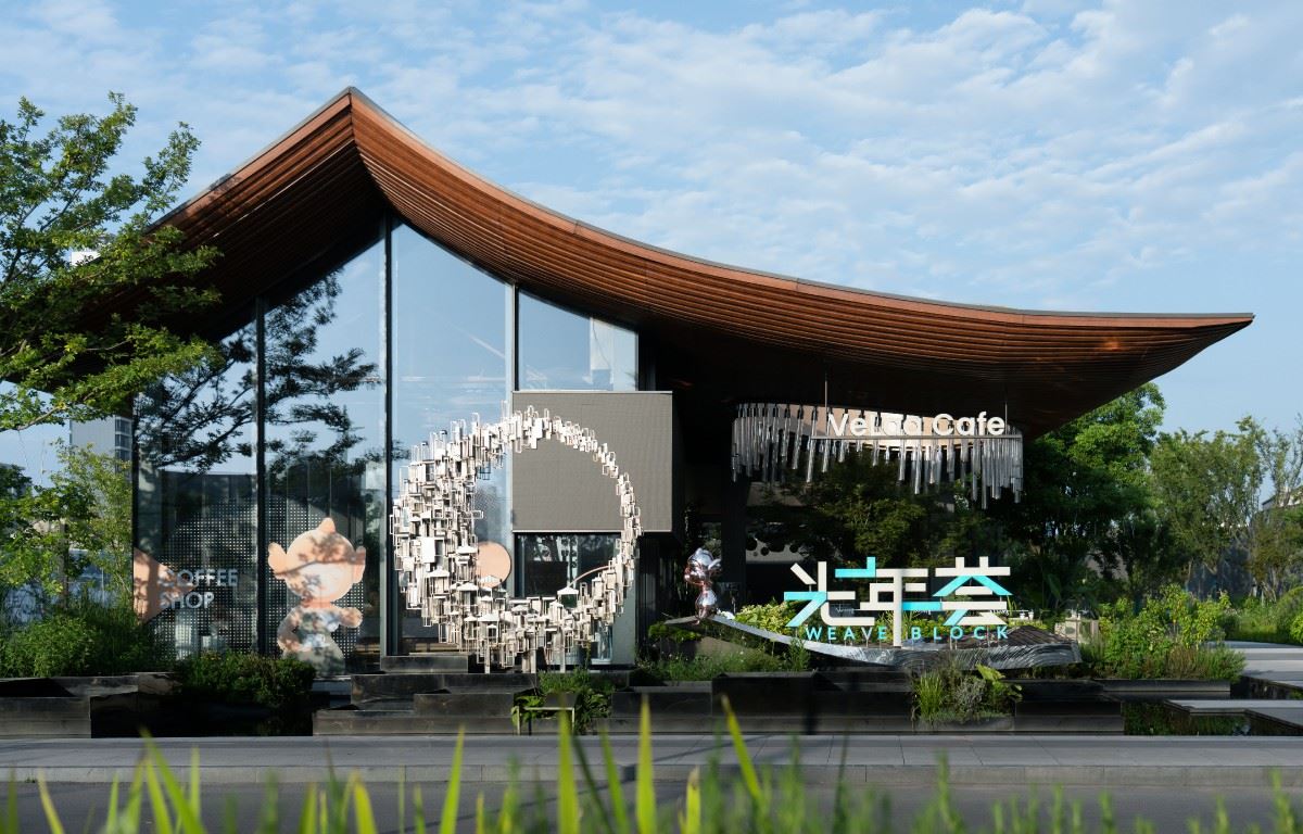
The arc of the logo interprets the beauty of Jinghu LakeThe sign design applies the agility of the water element to the guide and integrates it into the landscape.
 | |||||
JING lake water Qinrun Shaoxing's more than 2,500 years of humanistic history From Wang Xizhi to Lu You Then to the representative of modern humanities, Lu Xun Bibo Mirror Lake endows Shaoxing The Poetry and Elegance of Jiangnan From time immemorial The elegance here is constantly praised |  | ||||
 | |||||
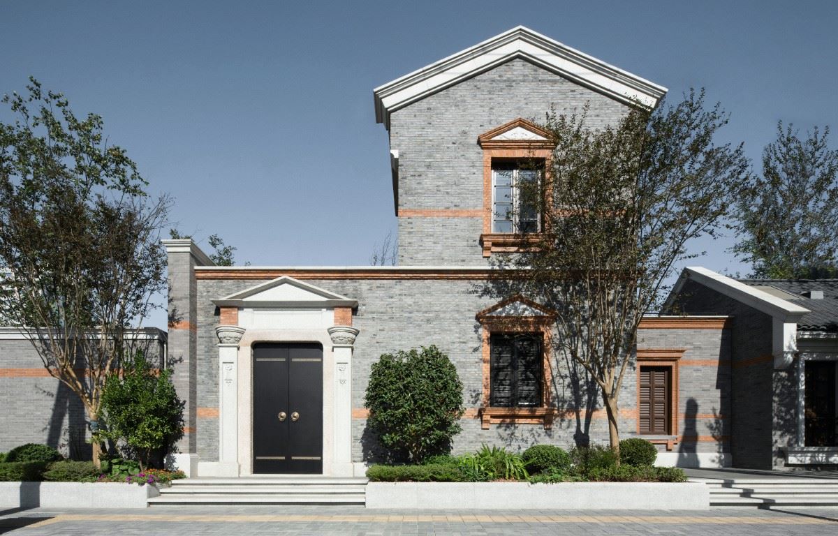
 | In Chinese Residence Aesthetics Living by the water is a very high spiritual connotation It brings wonderful mood to life At the same time, it also composes a moving movement for life Zhonghai Bojun adheres to artistic aesthetics On architecture, landscape, interior, signage Design concept with no sense of integration With the aesthetic tone of returning to nature Re-enable the feeling of space Create a modern hidden luxury landscape | ||||
 | |||||
 | |||||
ARC It is the control of details of architecture and landscape Let visitors feel advanced and refined The logo design combines the agility of the water element Used in wayfinding and integrated into the landscape Layers of waves on the lake Interlacing moment with Platinum Jun This fixed the body of the sign |  | ||||
 | |||||
 | |||||
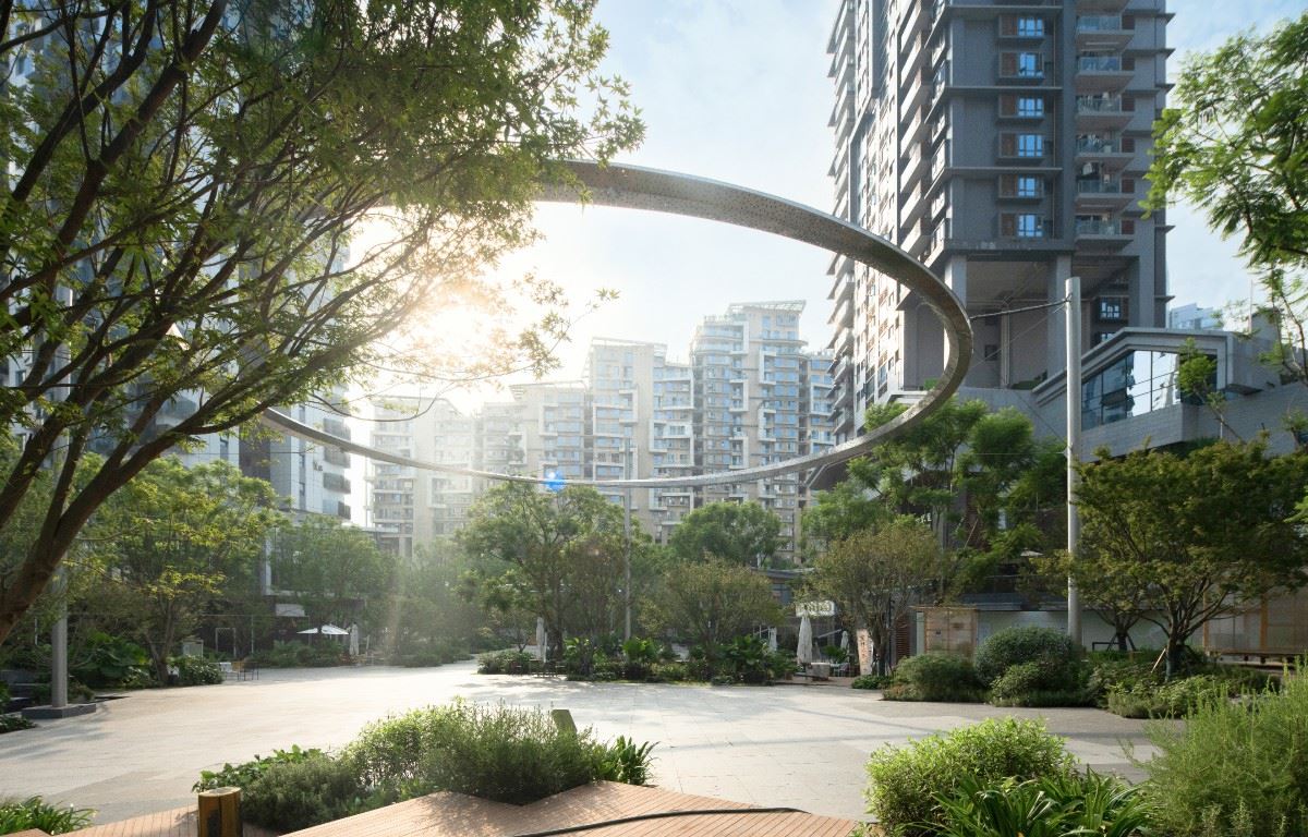
 | Signtype for exterior styling Emphasize the sense of arc interlaced composition Subtract the whole Prominent in volume 1 Echoes the uniqueness of the project Marina one The main color continues the architecture and landscape Presented in black and gold Contrast the high-end and low-luxury quality of the project According to the characteristics of the project LOGO We designed a whole set of icons for the project Only highlight the exclusivity in the details of the sign Taking into account both project tonality Also enhances the hierarchy of the sign | ||||
 | |||||
 | |||||
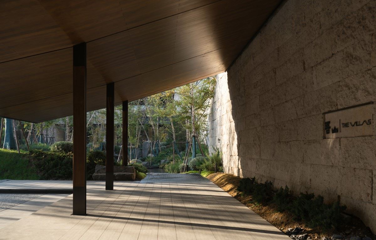
For the project From the staggered posture of standing To the stacking up of brand shapes Rounded corners from details to the slight arc of the line The continuation of flat visual symbols is equally important Professional unity in multiple fields Associate the sign with the environment Really good design 项目名称:绍兴中海·铂隽 项目地点:中国-浙江-绍兴 项目业主:绍兴中海海富置业有限公司 建筑设计:上海尤安建筑设计股份有限公司 景观设计:成都赛肯思创享生活景观设计股份有限公司 室内设计:上海拓臻建筑设计有限公司 雕塑设计:北京格思空间文化艺术有限公司 标识设计:柏熙标识 设计团队:刘广梅 宋丽 张超伟 李靖宇 王秋燕 标识施工:上海苏恩营销策划有限公司 摄影视频:云岫摄影 |  | ||||
 | |||||