The Glory
As bright as the rising sun, as vast as the stars.Through the logo, see the project; through the details, understand the essence.
 | |||||
"The sun and the moon seem to rise from within it; The stars, so bright and vast, seem to emerge from its depths." — The magnificent imagery penned by Cao Cao aptly interprets the core essence of Guangzhou Poly Tianyao. |  | ||||
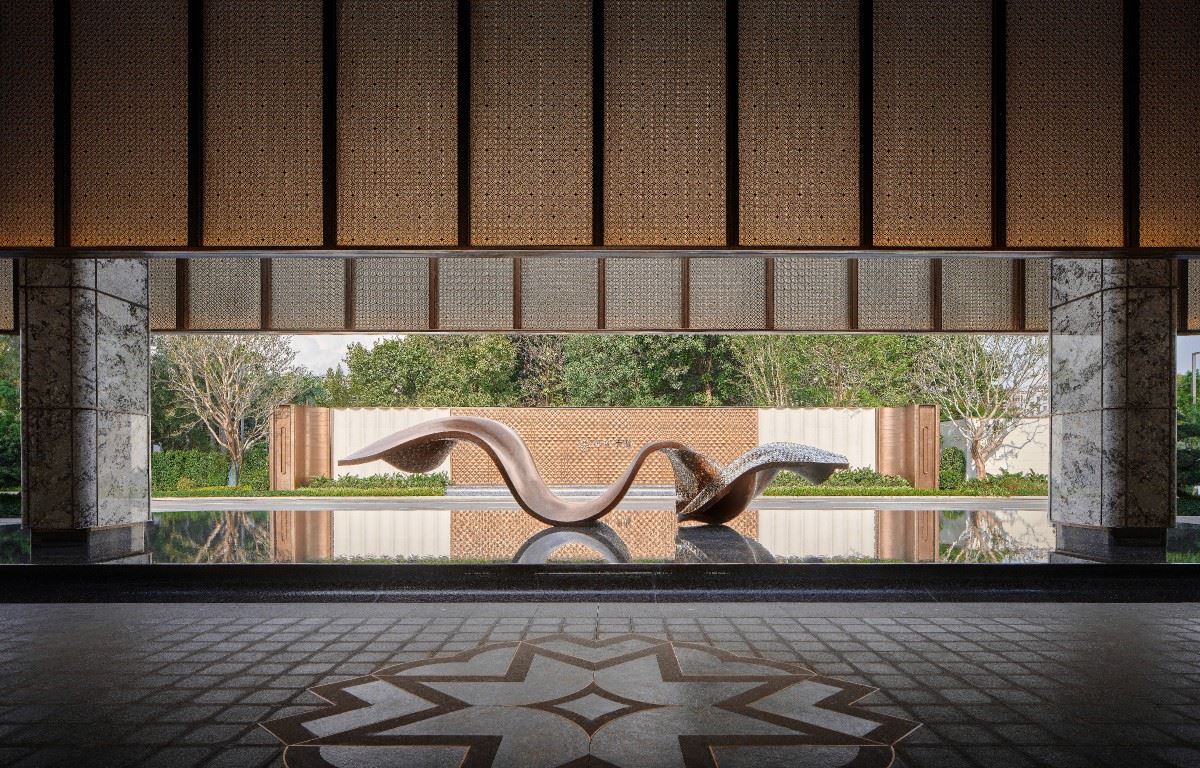
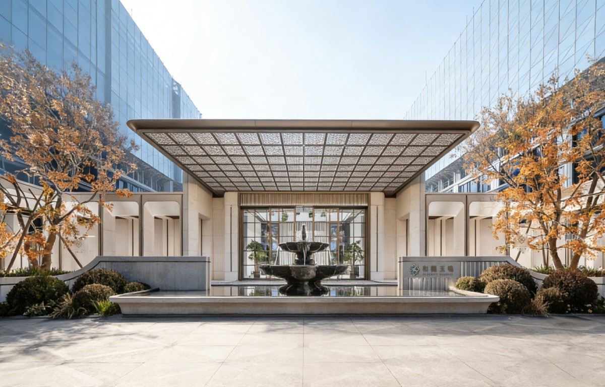
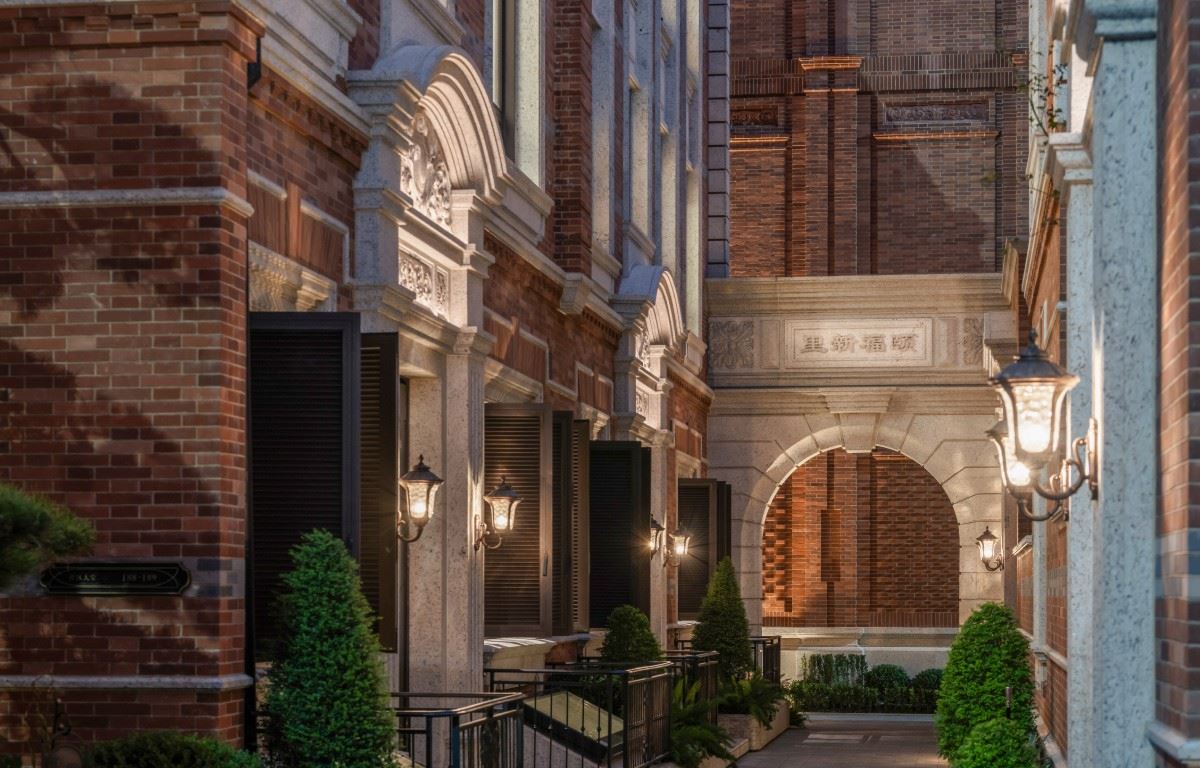
 | The project takes the morning light as a prelude and the starlight as a chapter, integrating the charm and cultural heritage of the core area of Guangzhou into every design detail. As a high - end residential benchmark in the core area of the "Zhujiang, Jinan, Pazhou" golden triangle in Guangzhou, Poly Tianyao seizes the opportunity of the industrial upgrade in the Financial City and takes advantage of the Pearl River waterfront resources to create a model of contemporary living. The project deeply explores the cultural value of the industrial heritage of the Guangzhou Silk and Linen Factory, transforms the craftsmanship heritage of silk and linen weaving and the unique texture of Lingnan culture into contemporary design language, and constructs a high - quality living space with a sense of order and tranquility for urban elites. | ||||
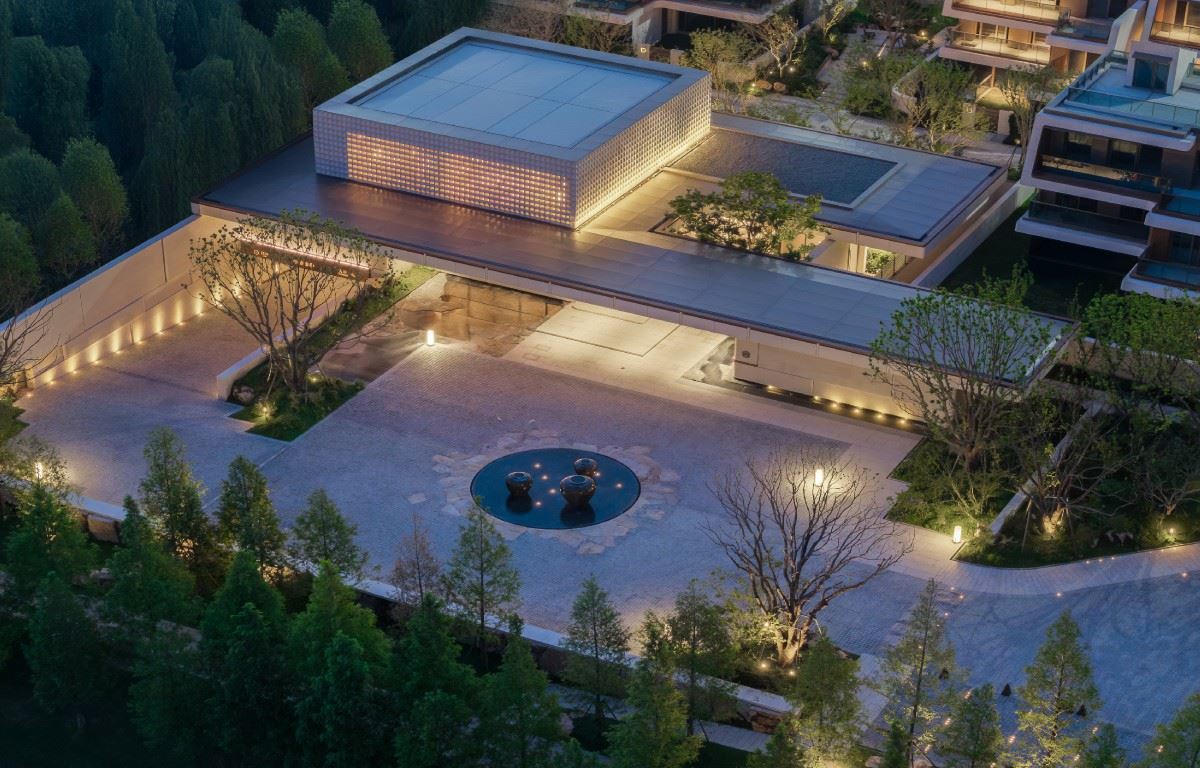
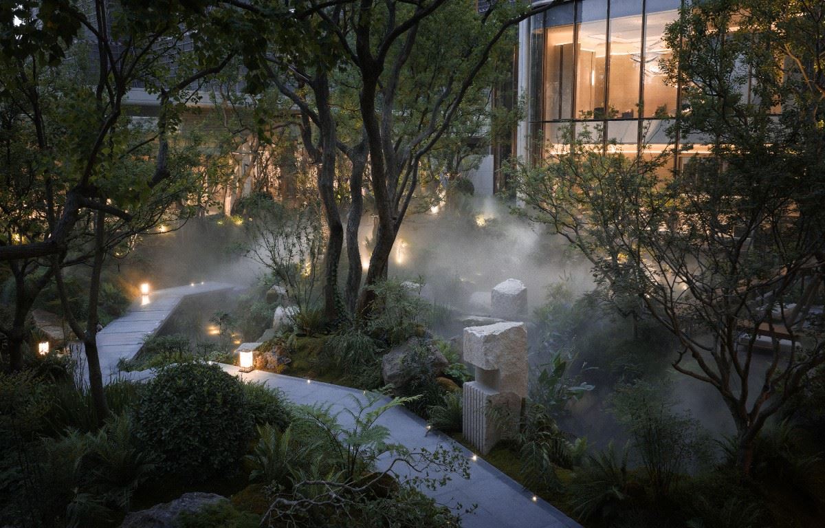
The Orderly Expression of Quiet Luxury against the Background of Urban Renewal In the process of urban renewal, Poly Tianyao adheres to the design concept of "inheriting the past to create the new and crafting the environment with exquisite workmanship", achieving an organic integration of the site's cultural heritage and top - level luxury quality. The unique weaving culture of the project's location has become the core inspiration and essence of the design: ・ Building Facade: Using warm and pure off - white walls, it skillfully integrates the texture of silk and linen weaving into the detailed design, achieving a harmonious coexistence of industrial memory and modern aesthetics. ・ Landscape Creation: Following the "old - money style" aesthetics, it creates a calm and introverted spatial texture through the hierarchical superposition of diverse materials. ・ Interior Decoration Design: Incorporating an artistic style, it permeates every corner of the space with meticulous details, fully interpreting the beauty of order and the sense of quality of top - level luxury living. |  | ||||
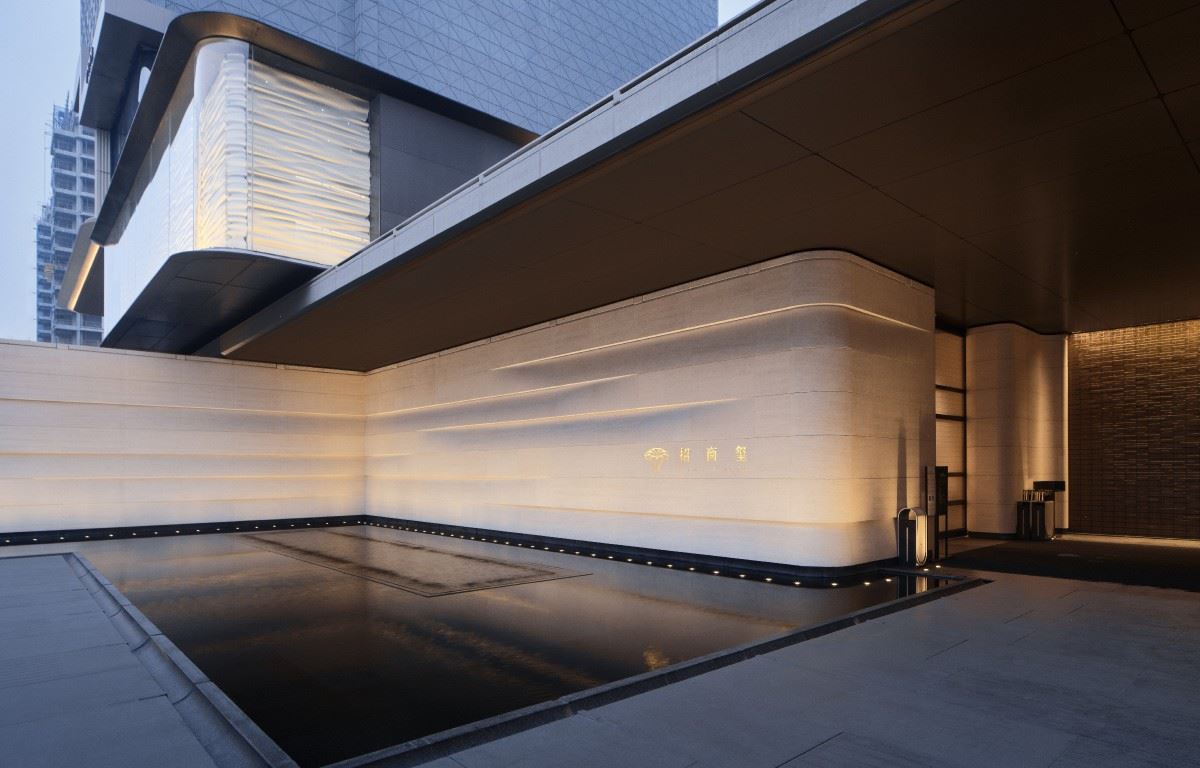
 | Using Patterns as Rhymes to Showcase Top - Level Luxury Style The logo design closely adheres to the project's calm, refined and luxurious "old - money style" temperament, aiming to highlight the project's core values. The design extracts the eight - pointed sun pattern from the LOGO and integrates it into the three - dimensional material hierarchy design. Through the collision of the three - dimensional form and materials, it not only retains the brand's core genes but also highly aligns with the project's top - level luxury positioning, subtly interpreting the high - end style and quality connotation. | ||||
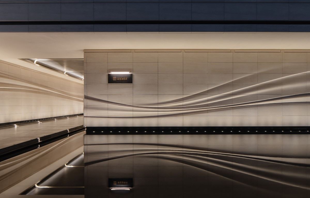
Minimalistic and Introverted, Precipitating Simple and Precious Qualities The selection of logo materials fully matches the project's overall gentle and warm temperament, accurately conveying the gentle lines and warm texture of the site to every detail of the logo. Based on the minimalist style, the design abandons redundant decorations and returns to the simplicity and preciousness of the materials themselves. Through pure texture expression, it conveys the project's calm demeanor and the sense of time - precipitated quality. |  | ||||
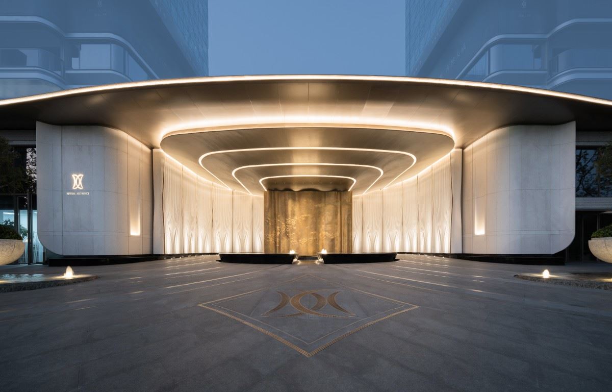
 | Three - Dimensional Symbiosis, Matching the Spatial Temperament The logo shape design focuses on the collaborative symbiosis with the project's overall environment. It extracts the component textures and arc elements from the site and presents them in a three - dimensional form in the logo design. Paired with the interlaced combination of special materials, the logo forms an organic whole with the architecture and landscape. It not only highlights the logo's own texture and features but also does not disrupt the overall harmony of the space, achieving a perfect unity of form and artistic conception. | ||||
Striving for Perfection and Overcoming Implementation Challenges The difficulty of the logo for this project does not lie in the form itself, but in how to achieve accurate implementation in a complex interface. ・Three - dimensional transformation of the eight - pointed sun pattern: After transforming from a two - dimensional to a three - dimensional component, the proportional relationship of the arc surfaces is complex. The thickness and angle between each layer need to be calibrated repeatedly, and the combination of aged materials requires multiple rounds of deliberation. During the design and proofing process, multiple adjustments were made before the final balance was achieved. ・Visual balance of the dragon - scale patterned wall: The dragon - scale patterned wall at the project site is finely crafted from 2,400 aviation - grade aluminum sheets. The texture is complex and rhythmic, and the logo is easily "swallowed" or appears abrupt. The solution lies in controlling the volume and light sense of the logo to find a balance between "showing" and "blending in". ・Clear recognition on the wavy curtain wall: The outer entrance section uses a large - scale wavy curtain wall. The surface is uneven, and the light and shadow changes are complex. The logo needs to remain clearly recognizable against this dynamic background without disrupting the overall rhythm of the interface. ・Process precision of multiple material combinations: The joint relationship between different materials is complex, with high requirements for process precision. The durability and effect stability need to be verified in advance. A large number of samples were made and experiments were conducted in the early stage, and repeated comparisons were made to ensure the final implementation effect. The logo design of Poly Tianyao starts from the symbol, extends to the space, and then is implemented in materials and processes, forming a complete expression system. In this process, we continuously deliberated on the proportions, repeatedly verified the materials, and made multiple rounds of adjustments to the details. What is finally presented is not just a logo system, but a perceptible spatial temperament. Through the logo, one can see the project; through the details, one can understand the temperament. And the experiences of continuous trial - and - error, correction, and refinement during the design process are the most real and valuable parts of this project. 项目位置:广东-广州 项目名称:广州保利・天曜 项目业主:广州保利 标识设计:上海柏熙标识有限公司 设计团队:代健美、章春萍、熊宝库、王秋燕 建筑设计:筑博设计 景观设计:朗道景观 室内设计:郑中设计 摄影视频:DO STUDIO |  | ||||