Hangzhou Vanke · Bai Lu Jun Xi
Logo language is indifferent to nature."Talk to everything"
 | |||||
Hangzhou Vanke · Bai Lu Jun Xi It is located on the Liangzhu culture plate Its own advantages are very obvious Liangzhu Culture It is one of the Neolithic cultural sites in China Its center is in Liangzhu, Zhejiang Province Therefore, Liangzhu culture is also known as "The origin of Chinese civilization" |   | ||||
  | In the early stage of project design We first studied the local culture Systematic understanding On Liangzhu Culture We are with respect In the later design process Try to put some of these symbols After deconstructing in a new way Add to design concept | ||||
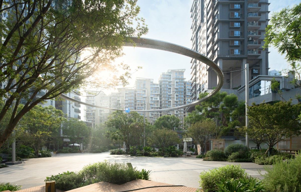
Landscape will be the theme of "dialogue with all things" A good continuation Such dialogues are often Spatial, temporal and regional It is also the recognition of Liangzhu Culture and memory At the beginning of design thinking There are countless possibilities Looking for the balance between man and nature |    | ||||
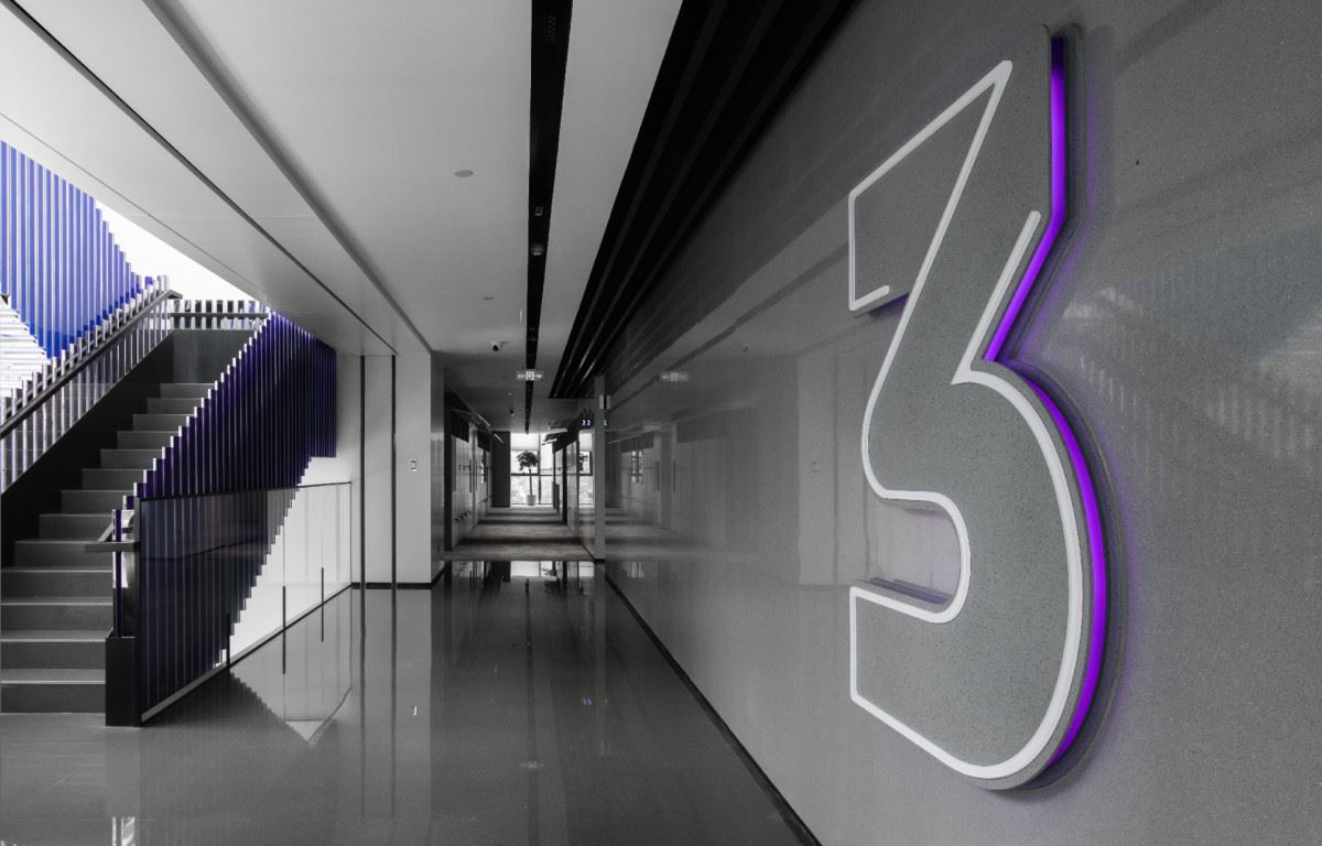
   | Perceive the rhythm changes of all things at different times Is the kernel that the project really wants to express The logo needs to be integrated with the landscape Maximize the connotation of the project Signs are architectural jewelry It is not a recurring and abrupt existence Throughout the project The location and form of signs are particularly particular | ||||
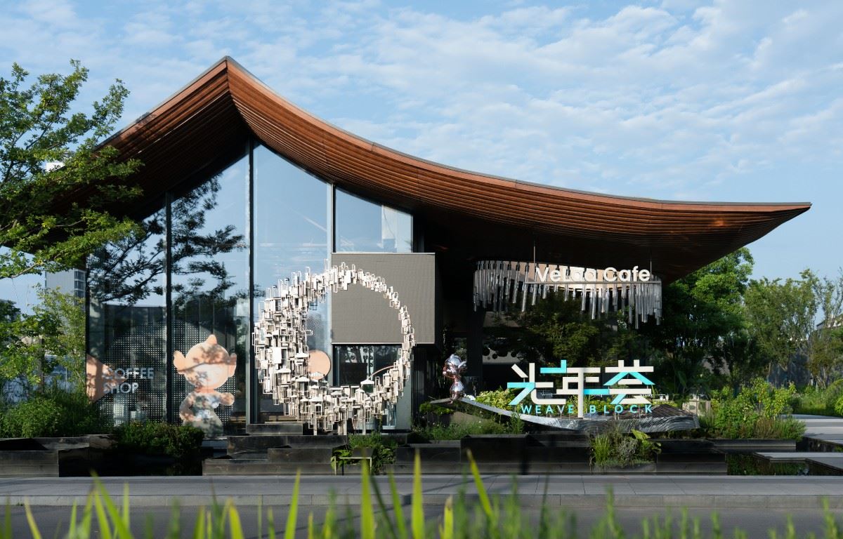
Like Hangzhou Vanke · Bai Lu Jun Xi We will consider the original material method Delete There are many details of the site itself In a natural environment We prefer the logo to be in pure form To meet the functionality of the project site |    | ||||
   | On icons and identification materials All signs are reflected Elements of Liangzhu Culture When considering the initial shape Want to combine the local characteristics of the texture of the pottery board Main material as identification But considering the relevance with architectural landscape Finally, select the brass plate that fits the temperament of the project Make it more natural and precipitated | ||||
During guide design We tried Drawing symbol elements extracted from Liangzhu Culture Derive node name font But I think the project is more suitable for simple tonality Therefore, the font design Start with the Japanese style |    | ||||
   | Font construction landing We also tried a lot of materials Textured ceramic plate stainless steel aluminum plate To the last selected yellow Tung board We optimize step by step So as to ensure the final effect of the project | ||||
In the process of this project There are many points worth recording To the local museum To understand the historical context Constantly search for information and improve the scheme Stocking on site Repeatedly modify design details These processes seem complicated But in the design But it can help us predict the landing effect Each design work For designers Like your own child Watch them from birth to landing To witness their growth and excellence These are the key elements of the project The most interesting thing |    | ||||
项目名称:万科·白鹭郡西 安岚 项目地点:杭州·良渚 甲方业主:杭州·万科 景观设计:JTL Studio 重庆 室外软装:杭州艺璨文化创意有限公司 建筑设计:浙江青墨建筑设计有限公司 标识设计:上海柏熙标识有限公司 标识团队:张燕琴、梅伟、彭亚男、唐隆燕、刘鉴、章春萍 标识施工:宁波晶工标识有限公司 摄影视频:云岫摄影 | |||||